Internal · Social Team
Maddock Films
Social Brand Mandate
The rules that make a Maddock post recognisable before anyone reads the caption. Everything here is measured from the live template files — not redrawn, not approximated. If a spec here disagrees with a file you were sent, this page wins.
01
Using this mandate
This is written for anyone producing a post that goes out on a Maddock channel — in-house designers, editors, and external agency partners. It covers the mechanical specs (what goes where, at what size) and the editorial rules (how it's written).
The five non-negotiables
If you remember nothing else, these are the ones that get a post sent back.
1 — Attribution is never optional. Every asset that carries footage or stills from a title must show that title. The pill device in §5 is how we do it.
2 — Nothing that matters lives outside the safe zone. Platform UI eats the edges. §6 has the exact numbers per format.
3 — One orange. #FF7F00. Do not sample the orange from an old JPEG, and do not use the website's orange.
4 — Display type is uppercase, tight, and heavy. Tracking −40. It should feel like a title card, not a caption.
5 — Start from the template. The PSDs in §13 are the source of truth. Rebuilding a layout from scratch is how drift starts.
How to read the numbers
Every measurement is given at delivery resolution — the size the file is actually exported at — not at the working resolution of the PSD. Some source templates are built much larger than delivery (the YouTube thumbnail PSD is 5333 × 3000, delivered at 1280 × 720), so scale everything proportionally if you work at a different size.
02
Logo
The wordmark is MADDOCK with the flame-form A, over FILMS between two rules. There are exactly two approved files. Pick by background, not by preference.

orange maddock logo.png
Use on black, on footage, on any dark or busy background. White wordmark, orange flame.
Maddock-logo black.png
Use on white, cream and light backgrounds only. Black wordmark, orange flame.
Clear space
Minimum clear space on all four sides = the cap height of the wordmark.
Nothing enters that margin — not subtitles, not a platform sticker, not another logo. When the logo sits over footage, the clear space needs to be visually calm too: if the plate behind it is busy, darken it rather than moving the logo.
Minimum size
| Context | Minimum width | Note |
|---|---|---|
| Video / Reels | 180 px | At 1080 × 1920. The FILMS rules break up below this. |
| Static post | 200 px | At 1080 px wide delivery. |
| YouTube thumbnail | 140 px | At 1280 × 720. Thumbnails are viewed small — verify at 210 × 118. |
Misuse
Never
- Recolour the wordmark or the flame. There is no white-only, no black-only, no single-colour version.
- Stretch, condense, rotate or skew.
- Add a drop shadow, glow, stroke or bevel to the logo itself.
- Place the black lockup on a dark background, or the orange lockup on white.
- Re-typeset "MADDOCK FILMS" in a live font as a substitute for the mark.
- Crop the mark, or use the flame A alone as a standalone icon.
Instead
- Need it on a mid-tone plate? Add a subtle scrim behind it, keep the logo untouched.
- Need more contrast? Increase the scrim opacity, not the logo weight.
- Need it smaller than the minimum? Drop the logo entirely and rely on the pill.
03
Colour
The palette is deliberately tiny: black, white, and one orange. The orange is an accent — it marks the thing you should look at. When everything is orange, nothing is. click a swatch to copy
Ratio
Roughly 90 / 8 / 2 — black, white, orange. Measured across the current template set, orange never exceeds about 2% of pixels on a finished frame. That restraint is the reason it reads as a brand signal rather than decoration.
Contrast
| Pair | Ratio | Verdict |
|---|---|---|
| White on black | 21.0 : 1 | Safe at any size. |
| Black on Maddock Orange | 9.6 : 1 | Safe. This is why secondary copy on the orange box is black. |
| Maddock Orange on black | 8.2 : 1 | Safe for display sizes and the pill stroke. |
| White on Maddock Orange | 2.2 : 1 | Fails. Never set white type on an orange fill. |
Legacy oranges
#FF7F00 is settled and final. Three other oranges are still in circulation from earlier work. None of them is a valid alternative — they are listed so you can recognise one when you meet it and replace it with #FF7F00.
| Hex | Where it appears | Action |
|---|---|---|
| #FF7F00 | Master logo PNG, all five social templates | Final. The only approved orange. |
| #F47921 | The flame inside Maddock-logo black.png | Superseded. Re-export the file to #FF7F00. |
| #E05C00 | maddockfilms.com --orange | Web only. Never on social. |
| #FF7A1A | maddockfilms.com --orange2 | Web only. Never on social. |
04
Typography
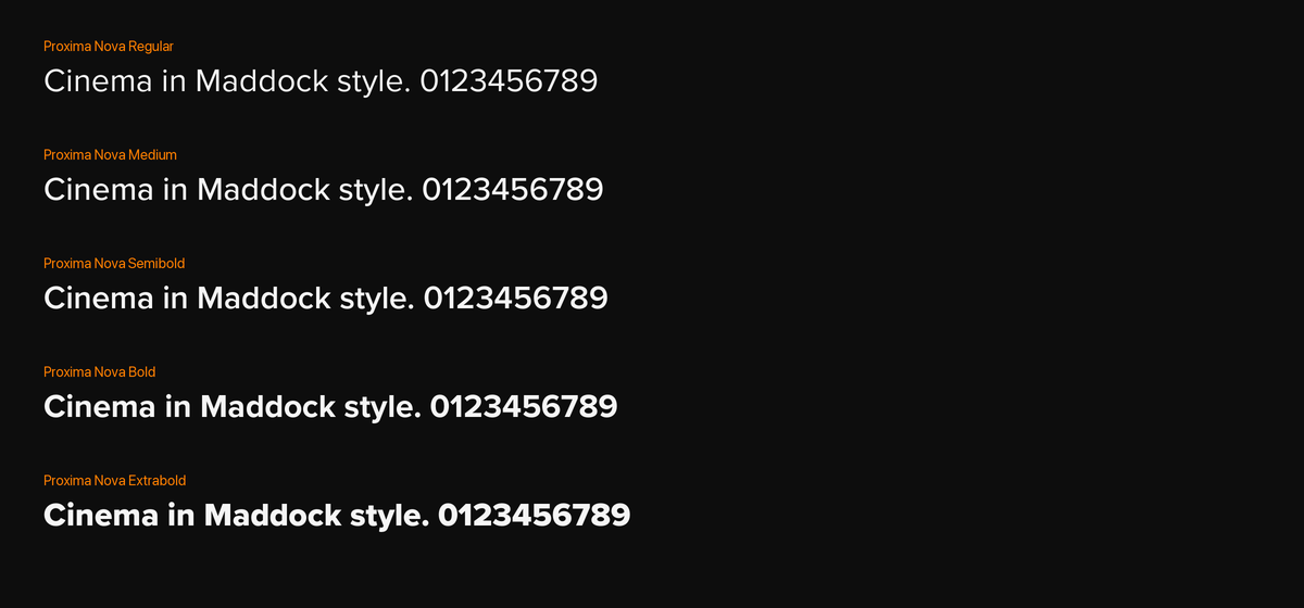
Three typefaces, three jobs, no overlap. Display carries the hook, body carries the information, and the attribution face is reserved for the pill so it always reads as a label.
All three are licensed for everyone who works on the brand. Archivo and Space Grotesk are free under the Open Font License, so any freelancer or agency partner can install them legally. Proxima Nova comes with Creative Cloud. Nobody has a reason to substitute a lookalike.
Watch at your own risk
Thamma · Chhaava · Munjya
Hierarchy on a frame
Reel cover and YouTube thumbnail both follow the same three-step ladder.
Primary is roughly 1.7× the secondary cap height, measured off the reel cover template (128 px against 76 px). Keep that relationship even when the copy is short — resist the urge to fill the width.
Line rules
- Primary copy: two lines maximum. Three means the hook is too long, not that the type is too big.
- Secondary copy: one line. It exists to date-stamp or name the title, not to explain.
- Break lines by meaning, not by width. Never leave a single orphan word on line two.
- No hyphenation. No justified text. Ranged left or centred, matching the template.
05
The attribution pill
This is the most distinctive device in the system and the one most often got wrong. It names the title a piece of footage came from, and it appears on every asset carrying footage or stills — reels, statics, community posts.
- Shape
- Fully rounded — radius = height ÷ 2
- Stroke
- 3 px, #FF7F00
- Fill
- Black, opacity set per image
- Type
- Space Grotesk Bold, white, uppercase
- Tracking
- −10
- Side padding
- ≈ 25 px each side of the text
- Text
- Optically centred in the pill
Fill opacity is the one thing you are meant to change. The template layer is literally named "adjust fill opacity according to image". Over a dark, calm plate the fill can drop near zero; over a bright or busy one, raise it until the white text holds. Legibility decides — not a fixed number.
What goes in the pill
- The title of the film or show the footage is from — nothing else.
- Set exactly as the title is officially styled: COCKTAIL 2 BHOOL CHUK MAAF STREE 2
- No year, no "official", no character name, no hashtag, no MADDOCK FILMS.
- Compilation posts spanning several titles: the pill names the title in the current shot, and changes with the cut.
- Original content that isn't from a title — BTS shot for social, vlogs, greetings — carries no pill.
Placement
Top-left in every format, inside the safe zone. It is a persistent label, not a lower-third — it stays on screen for the full duration of the shot it attributes, and it never animates in after the fact.
Sizing is set by the safe zone, not by one fixed rule
The pill is deliberately a different size in each format, because each surface has a different amount of platform UI sitting over the frame. Reels and Shorts are the most crowded — the app lays its own header, action rail, caption and handle on top of the video — so the pill is largest there, and it sits below the 200 px top exclusion so it clears the app's own interface. Static feed posts carry far less UI over them, so a smaller pill still reads cleanly.
Size the pill to the format's safe zone — never carry one format's pill onto another. Shrinking the 9:16 pill to match a static post pushes it into the app's own controls, and the title becomes hard to read against them. The safe zones in §6 are what these sizes are derived from.
Pill by format — as built in the templates
| Delivery size | Pill size | Inset from top-left | Share of canvas width | Why |
|---|---|---|---|---|
| 1080 × 1920 Reel | 224 × 61 px | 92 / 241 px | 5.6% | Heaviest platform UI; sits below the 200 px top exclusion. |
| 1080 × 1080 1:1 | 158 × 52 px | 29 / 29 px | 4.8% | Feed and Community — light UI, but often viewed small. |
| 1080 × 1350 4:5 | 109 × 35 px | 23 / 20 px | 3.2% | Largest canvas area, least UI over it. |
Pill widths above are for the sample titles in the templates — the pill grows with the title, keeping roughly 25 px of padding each side of the text. Height, position and radius are fixed.
06
Formats & safe zones
Every number below is measured from the template PSDs at delivery resolution. The dashed orange area is safe; the hatched red areas are where platform UI sits and where nothing important may go.
- Top exclusion
- 200 px
- Bottom exclusion
- 300 px
- Left / right
- 55 px each
- Action rail
- 180 px wide × 500 px tall, bottom-right
- Bottom-left block
- 180 × 500 px (caption & handle)
- Subtitle band
- 722 × 203 px, centred
- Subtitle baseline
- 298 px above bottom edge
- Pill
- x 92, y 241 · 224 × 61 px
- Grid crop
- Centre 1080 × 1440 (3:4)
- Scrim
- Black gradient, from y 992 to base
- Primary copy
- x 54, y 1356 · 971 × 128 px
- Secondary box
- x 170, y 1508 · 741 × 76 px
- Secondary text
- Black on #FF7F00
- Alignment
- Both centred on 540 px
The profile grid crops covers to 3:4. The template carries a guide layer at exactly 1080 × 1440. Both copy blocks already sit inside it — if you move them, check them against that guide, because a hook that gets sliced in the grid is a hook nobody reads.
- Pill
- x 23, y 20 · 109 × 35 px
- Logo
- 233 × 95 px, centred
- Logo baseline
- 44 px above bottom edge
- Grid crop
- ≈ 34 px trimmed from each side
- Carousels
- Logo on the last slide only
4:5 and 9:16 crop in opposite directions. The grid cell is 3:4, which is taller than a 4:5 post but shorter than a 9:16 cover. So a 4:5 loses about 34 px from each side in the grid, while a reel cover loses 240 px from the top and bottom. Note that the 4:5 pill starts at x 23, so its left edge is clipped by roughly 11 px in the grid thumbnail — the post itself is unaffected, and the title still reads.
- Margin
- 29 px all sides
- Pill
- x 29, y 29 · 158 × 52 px
- Logo
- Optional — pill alone is enough
- YT Community
- Feed preview crops to 1:1; assume the crop
- Logo
- 161 × 66 px, top-right
- Logo insets
- 44 px right, 49 px top
- Primary text
- 690 × 91 px, centred
- Text baseline
- 126 px above bottom edge
- Duration stamp
- Bottom-right — keep it clear
- Max words
- 4 — verify legibility at 210 × 118
Check every thumbnail small. Most viewers see it at about 210 × 118 px on a phone. If the primary text isn't readable at that size, the thumbnail has failed regardless of how it looks at full resolution.
07
Subtitles
Most of the audience watches muted. Subtitles are not an accessibility afterthought here — they are the primary read, and they are burned in.
| Property | Spec |
|---|---|
| Typeface | Proxima Nova Semibold or Bold |
| Case | Sentence case — not uppercase |
| Colour | White #FFFFFF |
| Backing | Black gradient scrim rising from the base |
| Band | 722 × 203 px, centred on 540 |
| Position | Baseline 298 px above the bottom edge |
| Lines | Two maximum, ~32 characters each |
| Alignment | Centred |
Rules
- Never uppercase. Sentence case is faster to read at speed and the template is built for it.
- Two lines, never three. If a line won't fit, cut the sentence — don't shrink the type.
- Break on sense. Keep a phrase intact rather than filling the line width.
- No stroke or drop shadow. The gradient scrim does the contrast work. If it isn't enough, deepen the scrim.
- Hindi and Hinglish set in the same face and size. Don't switch to a system Devanagari default mid-reel — check the glyphs render before export.
- Subtitles sit above the bottom exclusion, so the caption and handle never collide with them.
08
Writing for YouTube
The channel already has a strong, consistent title grammar. It exists to make a title scannable in a sidebar and searchable by cast name. Follow it exactly.
Trailers, teasers and songs
Live example
Cocktail 2 Official Trailer | Shahid Kapoor, Kriti Sanon, Rashmika Mandanna | In Cinemas 19th June
Live example
Eetha - Official Teaser | Shraddha Kapoor | Randeep Hooda | Dinesh Vijan | Laxman Utekar | 28th Aug 26
Clips, BTS and social-first content
Live example
All Hail The King 👑🔥 | Chhaava | Vicky Kaushal | Maddock Films #movie #fightscene #action
Rules
- Front-load the hook. YouTube truncates around 60–70 characters in most surfaces. Everything after the first pipe is a bonus.
- Pipes separate, commas group. Cast sharing one segment are comma-separated; distinct credits get their own pipe.
- Always credit Dinesh Vijan on title-related assets.
- Spell cast names in full. The current habit of abbreviating to fit — Rajkummar R, Dinesh V — costs search visibility. Drop a credit before you truncate a name.
- One emoji, maybe two. Placed after the hook, never mid-credit.
- Dates as 19th June 28th Aug 26 In Cinemas 19th June — never numeric-only.
Avoid
Prahaar Teaser | Rajkummar R | Wamiqa G | Jaideep A | Sikandar K | Dinesh V | Avinash A|7th Aug 2026
Seven abbreviated credits, and a missing space before the final pipe. Cut to three or four full names — Rajkummar Rao | Wamiqa Gabbi | Dinesh Vijan | 7th Aug 2026 — and the title gets shorter and more searchable.
Description
- First two lines carry the hook and the release date — everything else is below the fold.
- Then the standard block: synopsis, full cast & crew credits, then social links.
- Three to five hashtags at the end. Not thirty.
09
Writing for Instagram
The bio sets the register: "Cinema in Maddock style 🎬🔥 · Helmed by #DineshVijan". Confident, warm, a little playful. The studio talks like someone who loves films, not like a distributor issuing a notice.
Voice
We sound like
- Warm and in on the joke — especially for MHCU titles.
- Confident without boasting. The work carries it.
- Comfortable in Hindi, English and Hinglish, matching the film.
- Genuinely affectionate about cast and crew.
We never sound like
- Corporate — no "we are pleased to announce".
- Desperate — no "LINK IN BIO!!!" or engagement-baiting.
- Clickbait that the content doesn't pay off.
- Machine-translated Hinglish. If it wouldn't be said out loud, cut it.
Caption structure
Live example
Shayad humein bhi der se hi sahi, par aisa pyaar mile 🥹
Celebrating 6 years of Love Aaj Kal 💘
Emotional hook first, the news second. It works even if the caption collapses to one line.
Rules
- Instagram truncates at roughly 125 characters. The hook must survive alone.
- Emoji punctuate, they don't decorate. One to three per caption, placed at the end of a thought.
- Tag every person who appears. In the caption, not only in the tag layer.
- Release dates in the caption, not just the artwork — captions are searchable, artwork isn't.
- Never put critical information only in the image. Assume some readers get text only.
- Hindi in Devanagari or Roman, consistently within a post. Don't mix scripts mid-sentence.
11
Do & Don't
The failures that actually recur, gathered in one place.
Do
- Open the template and work inside it.
- Set the pill fill opacity by eye, per image.
- Check reel covers against the 3:4 grid crop.
- Check thumbnails at 210 × 118 px.
- Spell cast names in full.
- Keep display copy to two lines.
- Burn in subtitles on every reel.
- Export sRGB.
Don't
- Eyedrop the orange from a compressed JPEG.
- Use the website's orange on social.
- Set white type on an orange fill.
- Put type in the bottom 300 px of a reel.
- Let anything cross the 180 px action rail.
- Add a stroke or shadow to subtitles.
- Uppercase the subtitles.
- Ship a footage post without a pill.
- Substitute a lookalike font because Archivo isn't installed.
12
Pre-publish checklist
Run this before anything leaves the building. progress is saved in this browser
Every asset
Reels
YouTube
13
Downloads
Files are bundled with this page so they work without Drive access. The Drive folder remains the source of truth — if the two ever differ, Drive wins and this page needs updating.
Logo
Templates
Fonts
Source
14
Open items
What's still unresolved in the source files. None of it blocks work — each item has a working rule above — but each needs closing out. Decisions already taken, like the brand orange, have moved into the sections above and are no longer listed here.
| Item | Finding | Working rule |
|---|---|---|
| Black lockup flame | The orange question is closed — #FF7F00 is final. But Maddock-logo black.png still contains the superseded #F47921 and needs re-exporting. |
Ship the corrected file, then replace it in Drive and here. |
| Website diverges | maddockfilms.com runs Bebas Neue and Barlow, not the social type system, and a different orange pair. | Treat web and social as separate systems for now. Flagged for a decision. |
| Founding year conflicts | The website says founded 2020; the YouTube channel says established 2010. | Don't cite a year in social copy until confirmed. |
| Long-form video template | The doc lists "YouTube Long Form Video Template + Attri + Subtitles" but no file is linked. | Missing. Use the Reel subtitle spec, adapted to 16:9, until it's supplied. |
| No Story-specific template | Stories reuse the Reel safe zone, but Story UI differs — sticker and reply-bar zones aren't mapped. | Use the Reel safe zone. Verify before shipping sticker-heavy Stories. |